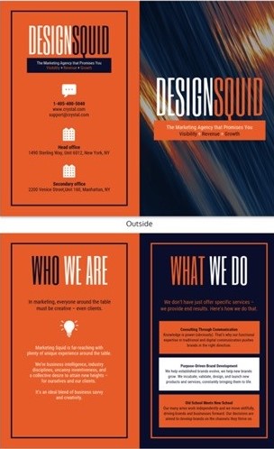
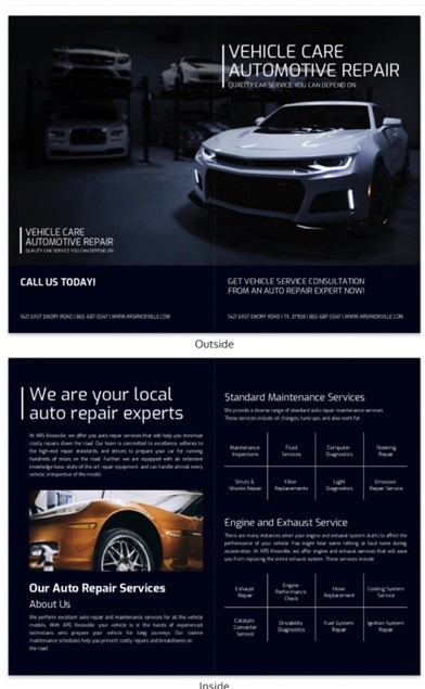
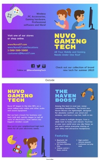
Your online brochures are one of your most effective tools for promoting and selling your business. It’s a distillation of all you know about your company, its products, and its services. And like any other tool, if not properly designed or easily rendered useless by competition within the industry. You may want to consider a brochure maker.
Table of Contents
Make Yours Stand Out
With that in mind, here are twelve ways to make your online brochure, well, stand out from the competition with the right brochure maker.
1. Get Creative With Your Brochure Design Cover—and Pay Attention To Detail
The first part of your brochure that grabs the reader’s attention is the cover. And just like your product packaging should be eye-catching and versatile, so should your brochure cover.
If you’re a restaurant, design a cover that reflects the fun you have in your business—think Muppet-style humor. If you’re selling musical instruments, make sure there’s something musical about your cover.
Using an online brochure maker tool like Wepik will help you to create and customize your brochure cover using templates.
Your cover is also where you want to make sure all of your contact information is accurate and easy to read. When someone takes the time to pick up your brochure, that person is interested in you and your business.
So make sure she can find you easily if she wants to learn more or place an order.

2. Use White Space for Emphasis on Your Company Brochures
Every element on the inside of your brochure should have a purpose. But because there are so many elements—words, pictures, graphics, logos, block quotes—it can sometimes be easy to let everything become an illegible mass of type. To avoid this, use white space effectively.
White space is simply the amount of empty or blank space surrounding any element on the page (such as text or graphics). It’s important because it serves several functions within your design:
- Helps break up text for easy reading
- Highlights elements that are most important to your business
- Makes pages appear less cluttered and more organized
Use a simple ruler in Microsoft Word or another word-processing application to determine how much space you want between each element. You can also play around with different combinations until you see what looks best with your material.
However, take care not to make your white space too large, or else it’ll overshadow the material within.
3. Make Sure All of the Contact Information in Your Digital Online Brochures Are Clearly Labeled
As I mentioned in tip #2, be sure that your customer can easily find you if she wants to follow up with an inquiry, place an order, or schedule an appointment.
Every element of information should be clear and concise—and every link within the document should work (or lead to a web page where they will).
4. Use Block Quotes on Your Online Brochures for Testimonials
Testimonials are one of the most powerful tools in your marketing arsenal because they come directly from customers who have used your products or services before. If you’ve got some glowing words about how great you are, use them in your brochure for added credibility.
Be sure to include the name of the company, what they do, and where you can find them online if interested in learning more about their business. Block quotes are also a good way to add in some outside opinions without having too many competing voices on one page or section of your brochure.

5. Illustrate the Benefits Rather Than the Features in Your Product Brochure
Whenever possible, illustrate how your products or services can benefit others instead of just listing off all of its features. A picture is worth 1,000 words when it comes to showing people how something works—so show ’em!

6. Make Your Product Pages Easy To Read
A common mistake with local business marketing materials is to make the product pages too long. However, anyone who’s ever browsed a website knows that scrolling through 3 or 4 screens of text is not only hard on the eyes but also extremely annoying.
So when using your online brochures to highlight individual products made by your company, be sure that they’re broken up into short, easy-to-read sections.
7. Use QR Codes to Link to Online Resources
If you want potential customers to be able to find more information about any element in your brochure beyond what you’ve included here—whether it’s another service or product outside of your primary industry—then use QR codes (those funny-looking boxes with dots all over them).
All someone needs to do is snap a picture with their smartphone and a webpage will open up the company’s website, blog, or even a separate page with all of the additional information.

8. Use Photos On Online Brochures That Show How to Use Your Product
If you’ve got any products in your brochure that need to be shown being used during installation—like electrical components, bathroom fixtures, tile work…whatever!—then definitely include photos.
They don’t have to be elaborate or even professional; just make sure they give potential customers an idea of what it looks like when someone is using your product correctly.
If you don’t have photos or images, why don’t you give Venngage a try? This leading brochure and flyer maker will do the job easier for you.
9. Include Testimonials From Satisfied Customers
Another great way to add credibility to your marketing materials is through testimonials from past clients who were satisfied with their purchases or services rendered. If you’ve got a great relationship with the people who walk through your door, ask them to write up something about how awesome you are.
These testimonials will look great on your online brochures as well as on your printed brochures.
Conclusion of Creating Online Brochures
There you go, some big ways to make your brochure stand out from the rest. Time to start designing! Have you ever used a brochure maker or created an online brochure for your blog or business?
I’d love to hear about it in the comment section below.
- The Best Blogging Strategies for Finance and Investment Niches - February 20, 2025
- How To Fix Orphaned Content On Your Website To Rank Higher - February 20, 2025
- Online Business Owner: 8 Skills & Strategies You Need to Grow - February 19, 2025


