One of the best ways to increase your website sales and conversions is to improve your website’s SEO and avoid common SEO mistakes.
But here’s the catch: SEO is NOT easy. There’s a lot of competition, and then there are freaky updates from Google.
But most importantly, if you’re struggling to increase your website’s organic traffic even after publishing great content, it might mean you’re making some critical SEO mistakes.
Here are some of the BIGGEST SEO mistakes most bloggers make and ways to avoid them.

Table of Contents
The Biggest Mistakes In SEO To Avoid
1. Not Picking The Right Keywords
Hands down, strategic keyword research is the key to increasing Google’s traffic.
Most website owners either ignore keyword research or do it wrong.
How can you increase your search traffic if you do NOT find and target the keywords people are looking for?
Also, do NOT target high-volume keywords, as they are difficult to rank in search engines.
If you’re getting started, start with long-tail keywords.
Long-tail keywords are often:
- Easier to rank for (as they have fewer searches in general)
- Help you with better conversions and
- Help you attract HIGHLY relevant people from search engines
Instead of targeting short-tail keywords like “website builder,” you can target long-tail keywords like “Easy website builder for small businesses” or “Best free website builder for beginners.”
You don’t have to spend hundreds of dollars on premium tools to find long-tail keywords when starting. For most people, free tools are enough.
You can use free tools like Ubersuggest to begin your keyword research.
Here’s a quick tutorial on using Ubersuggest to find long-tail keywords.
To begin, enter any seed keyword or topic of your choice.
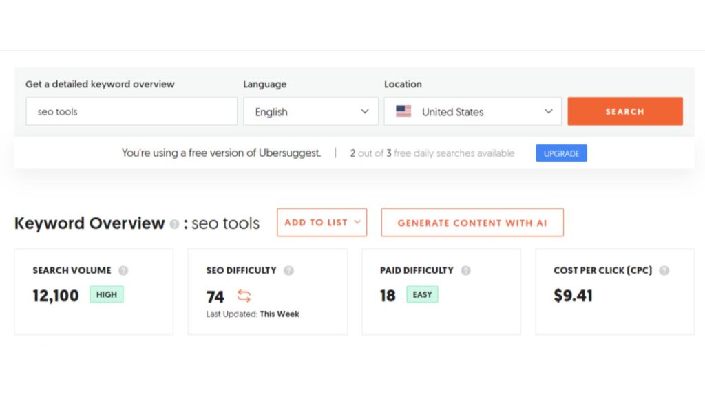
As you can see, the tool will show you essential keyword data, including;
- Search volume
- SEO difficulty
- CPC value
When you scroll down, you’ll find many relevant long-tail keyword suggestions with fewer searches.
Similarly, you can use other free tools to find long-tail keywords for your blog posts.
Here are a few free keyword tool options;
- Google Keyword Planner
- WordStream
- KeywordTool.io
- The Right Blogger
Remember, proper keyword research is an ongoing process. You’ll get better at finding proper keywords with time.
Once your blog or website generates more traffic and sales, you can invest in premium tools like Semrush or Ahrefs, which offer more keyword ideas, accurate data, etc.
2. Ignoring Search Intent
Most people create content without understanding the INTENT behind the keywords they target.
If you want more organic visitors to your website, do NOT ignore search intent.
Understanding the search intent can help you;
- Create the BEST content for your audience
- Improve search traffic
- Build trust and authority
What’s the BEST and EASIEST way to understand the intent behind each topic?
Analyze the current top-ranking content for your target keywords.
That’s how you understand what kind of content (articles, videos, infographics), format (long-form or short), and writing style (informative, casual, humorous) users prefer.
Types of Search Intent
There are FOUR primary types of search intent;
- Informational: People are looking for SPECIFIC information. They might type in questions like “how to start a blog” or “what is search intent.”
- Transactional: People are trying to make a purchase. For example, they might search “buy web hosting online” or “best smartphone deals.”
- Navigational: People are trying to visit a specific website or brand. For example, they might search “Private Instagram Search” or “Gmail signup.”
- Commercial: People are considering a purchase but are still researching a product or service. They might search for “best laptops for students” or “top email marketing platforms.”
3. Common SEO Mistakes Include Not Updating Content
Not updating your old content is a BIG mistake.
Do you know why? “Content freshness” is a crucial factor for search engines like Google.
Google loves to provide up-to-date information to its search users. That’s why FRESH content outranks outdated content.
Most website owners fall into the trap of constantly creating new blog posts. They often ignore updating their existing content.
If you’ve published over 100 blog posts and are still struggling to attract 1000 visitors daily, STOP publishing MORE content. Instead, improve the quality of existing posts.
Focus on quality over quantity. Ten high-quality and in-depth articles are better than fifty mediocre blog posts.
Revamp your existing content, and you’ll start noticing a growth in your search traffic.
Here are some proven ways to breathe life into your old blog posts:
Identify the top-performing posts: You don’t have to pick many existing blog posts to work on. Start by identifying 5 to 10 posts that are sending the most traffic. Look at Google Analytics or use tools like Semrush to find your top posts.
Perform keyword research: Once you’ve identified high-performing posts to update, conduct keyword research to find MORE relevant keywords.
These keywords can include;
- Semantically related keywords
- Question keywords
- Phrase-match keywords
The key here is to optimize each one of your existing posts with at least one primary and multiple secondary keywords.
Update information: You can tweak everything from the meta description to the introduction and conclusion. Update statistics with the latest data, address new points, and add fresh insights.
Merge or redirect: If any of your existing blog posts are not sending ANY traffic and are irrelevant to your blog’s core topics, you can merge those posts or use 301 redirects.
That way, you’ll improve your website’s overall SEO. Removing irrelevant content and merging it into a similar topic can improve the overall topical authority.
Add an FAQ section: Make sure to include an FAQ section at the end of your blog posts by targeting question keywords. They often help you rank in featured snippets or rank for voice searches.
You can use free tools like Answer The Public or Google’s “People Also Ask” section to find relevant questions to include in your FAQ section.
4. Assuming Content Creation Is Enough
The BIGGEST SEO mistake is believing that your content ranks itself. It does NOT rank itself.
Content creation is just one part of the SEO game. You need to conquer a few more things, such as;
- Content optimization: Content optimization is NOT stuffing your content with keywords. It’s all about satisfying the searchers with helpful content and naturally adding relevant keywords. Include appealing images with proper ALT tags and write compelling titles and meta descriptions.
- Building backlinks: The whole purpose of building links is to boost the authority of your content. Some of the best ways to find and build relevant links include writing guest posts, publishing helpful answers on Quora, blog commenting, social bookmarking, blogger outreach, etc.
- Fixing SEO-related issues on your website: Make sure to perform regular website audits to find and fix SEO issues on your site. Fixing broken links, crawl errors, improving site speed, etc, makes it easier for search engines to understand and index your content.
Above all, try to build links to your content after publishing it.
You can write Quora answers or use sites like Medium and LinkedIn to link to your blog posts. The key here is to publish helpful content on these platforms and naturally add relevant links to your blog posts.
5. Thinking That SEO Is A Sprint
Most newbies quit within the first six months of their blogging journey over SEO mistakes.
They do everything right, like creating great content, building links, getting more social shares, etc., but they might expect results QUICKLY.
Remember, new blogs won’t jump to the top of search rankings overnight.
Building a high-traffic blog takes time and consistent effort.
When I started my blog BloggersPassion in 2010, only 3000 people visited in the first year.

I did NOT give up.
I knew it would take time, so I continued creating quality content, building relevant links, etc. Within a few years, my blog started attracting thousands of visitors.
Fast forward to 2024, my blog generates millions of visitors from search engines.
Last year, over 1.2 million people visited my site.

How long will it take before you see results?
There’s no set timeframe, as it depends on many factors, such as your niche, overall competition, and the trend for the keywords.
However, I recommend you set realistic expectations and focus on progress, not just results. That’s the most common SEO mistakes many make by not having patience.
So, what’s the takeaway?
Successful SEO takes months, sometimes even a year or more, to really show its impact.
Conclusion: Common SEO Mistakes To Avoid Today
Finding relevant keywords, building links, and improving your website user experience can improve your overall search traffic.
The key to successful SEO is experimenting with different things, failing, failing again, and learning from your mistakes.
Are you making any of the above-mentioned common SEO mistakes? Do you have any more questions? Let me know your thoughts in the comments.
FAQ: 5 SEO Mistakes People Make (How To Avoid Them)
Search engines now prioritize quality content over keyword frequency. Stuffing keywords can make your content look spammy and hurt your rankings. Focus on natural placement and context.
Don’t copy content from other sites or even from your own pages. Use canonical tags to signal to search engines which version of a page to index. Rewrite content to make it unique.
More people use mobile devices to browse the web. If your site isn’t mobile-friendly, you’ll lose visitors and rank lower in search results. Use responsive design to ensure your site works well on all devices.
Outdated content can misinform users and reduce trust. Regularly update your content to keep it relevant and accurate. This also signals to search engines that your site is active and valuable.
A slow website frustrates visitors and increases bounce rates. Search engines favor fast-loading sites in their rankings. Optimize images, use caching, and minimize code to improve load times.
- 13 DIY SEO Tips to Skyrocket Your WebSite Traffic - March 22, 2025
- 5 Essential Ways To Increase Your Website Sales - July 22, 2024
- 5 SEO Common Mistakes People Make (How To Avoid Them) - June 28, 2024

Hi Lisa,
The biggest SEO mistake I used to make was failing to understand the search intent for my keywords. Many times, I didn’t realize that people using this keyword were really just looking for a specific business, song, or even a definition.
Now, I put more effort into making sure my content lines up perfectly with their search intent.
Cheers!
Hi Patrick, that is something I’m working on to – learning more about the search intent vs. keywords. Having that content line up better will surely help your SEO efforts. Thanks for coming by and have a wonderful day Patrick.
We are a carpet cleaning business and are receiving constant calls from SEO companies promising better search engine ranking. We are having a difficult time vetting these callers to make a decision on who will do a good job. Thank you for the insight, your article gives us good questions to ask a potential SEO partner. Wish us luck!
Hi John, welcome to Inspire To Thrive. I used to get those calls when I first began the business here. It’s hard to vet too which are really from Google or not. Some are resellers and certified but not actually Google, so beware. I’m glad this article helped you to know which questions to ask now, good luck! Thanks for your input. Have a great day.