Most people decide to tap or keep scrolling before your video even starts. Your thumbnail does that first job for you, and it has to do it fast. That’s why you need to know how to create video thumbnails that are better and easier to produce.
If you create long-form videos or YouTube Shorts for YouTube, Meta Reels, or your blog, a weak thumbnail can sink a strong video. A clear custom video thumbnail can lift your watch starts, improve clicks, and make your brand look more polished. T
The tricky part is that YouTube and Meta don’t always handle thumbnails the same way, so your design choices for video thumbnails need to fit each platform.
Table of Contents
Key Takeaways
- Thumbnails must be instantly clear on mobile: one main subject, strong contrast, and simple visuals that stand out in a fast scroll.
- Use large, readable text sparingly—only 2-4 bold words if it adds instant context; skip it if the image tells the story.
- Fliki AI generates three auto-thumbnails per video for quick picks; TubeBuddy tests YouTube performance; Canva offers full custom control.
- Stick to specs: 16:9 aspect ratio, 3840×2160 pixels, JPG/PNG/GIF under 2MB, and always match Community Guidelines.
- Prioritize honesty and curiosity—clear thumbnails that match the video earn taps without misleading.
What Makes a Good Video Thumbnail on YouTube and Meta Reels?
A good thumbnail is easy to understand in one second. That’s the whole game. If someone has to squint, guess, or decode what they’re looking at, you’ve already lost the click.
On YouTube, custom video thumbnails are standard, so you usually get more control. On Meta Reels, you may need to select a frame from the video or use an auto-generated thumbnail, depending on how you post. That means you can’t use the same approach every time.
What works across both platforms is pretty simple:
- Clear subjects
- Strong contrast
- Large, readable text
- A consistent visual style
- An honest match between the image and the video
Technical Requirements
Stick to the right specs to avoid upload issues.
- YouTube thumbnails need a 16:9 aspect ratio and an image resolution of 3840 x 2160 pixels for best quality.
- Supported file types include JPG, GIF, and PNG, with a typical limit of 2 MB per file.
All images must comply with Community Guidelines to prevent copyright strikes. If your thumbnail doesn’t make sense on a phone screen, it doesn’t work yet.
 Use simple visuals that still stand out in a fast scroll
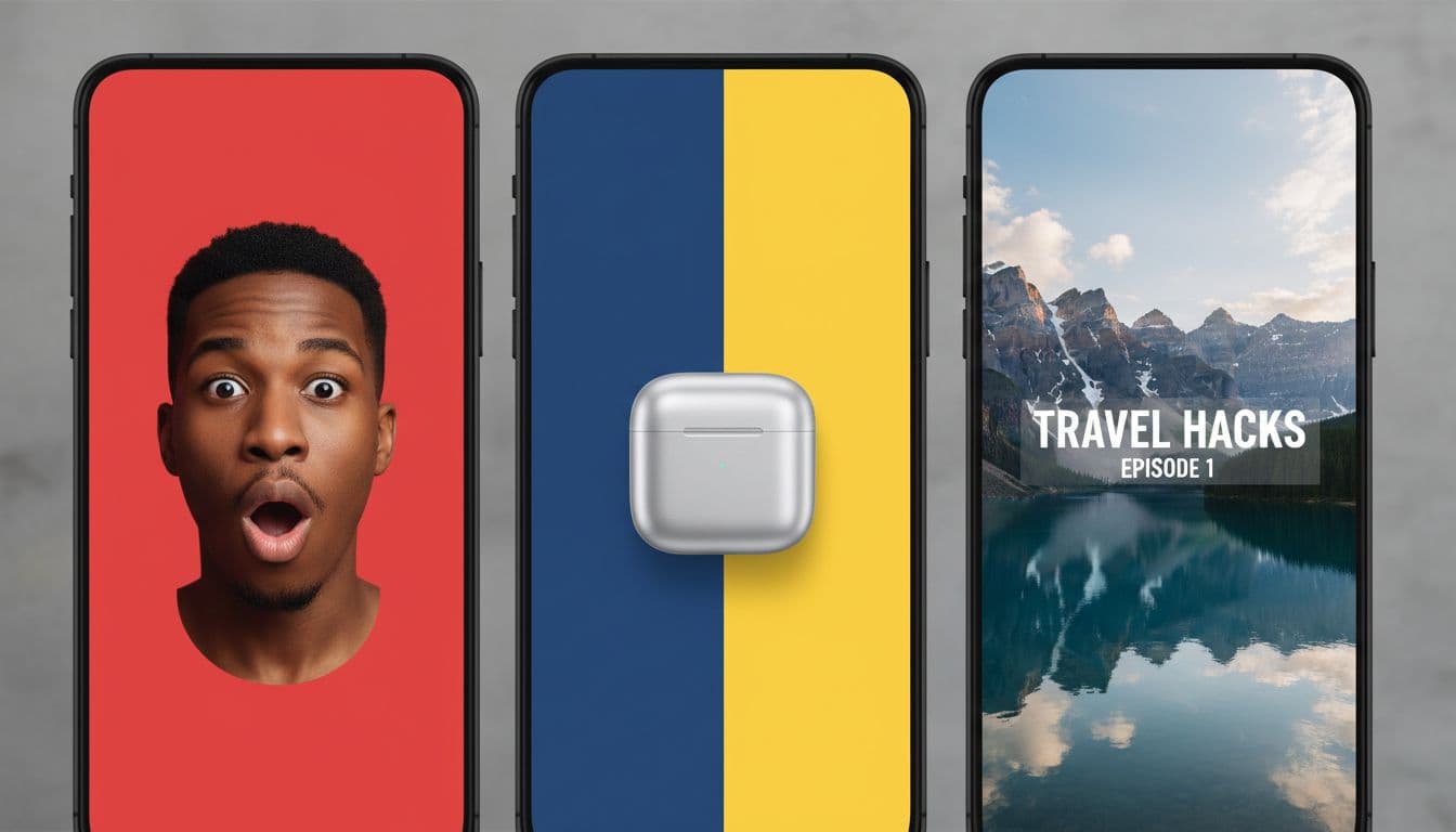
Clutter is the enemy. A thumbnail packed with tiny objects, too many colors, or five ideas at once usually falls flat on mobile.
You want one main subject and one clear focal point. That could be a face, a product, a bold gesture, or a before-and-after setup. Close-up faces often work because people read emotion fast.
A strong object shot can work too, especially if your video is about a tool, product, or visual result.
Bold colors help, but only if they support clarity. High contrast matters more than fancy design. Think less “mini poster,” more “billboard at 60 miles per hour.”
Write thumbnail text only when it adds instant context
Text can help, but only when it earns its spot. If you’re posting a tutorial, review, or comparison, a short phrase can sharpen the message fast.
Keep it short. Two to four words are often enough. Use large fonts, thick letters, and strong contrast against the background. Tiny text might look fine on your laptop and disappear on a phone.
Some thumbnails don’t need text at all. If the visual already tells the story, leave it clean. More words don’t mean more clicks.
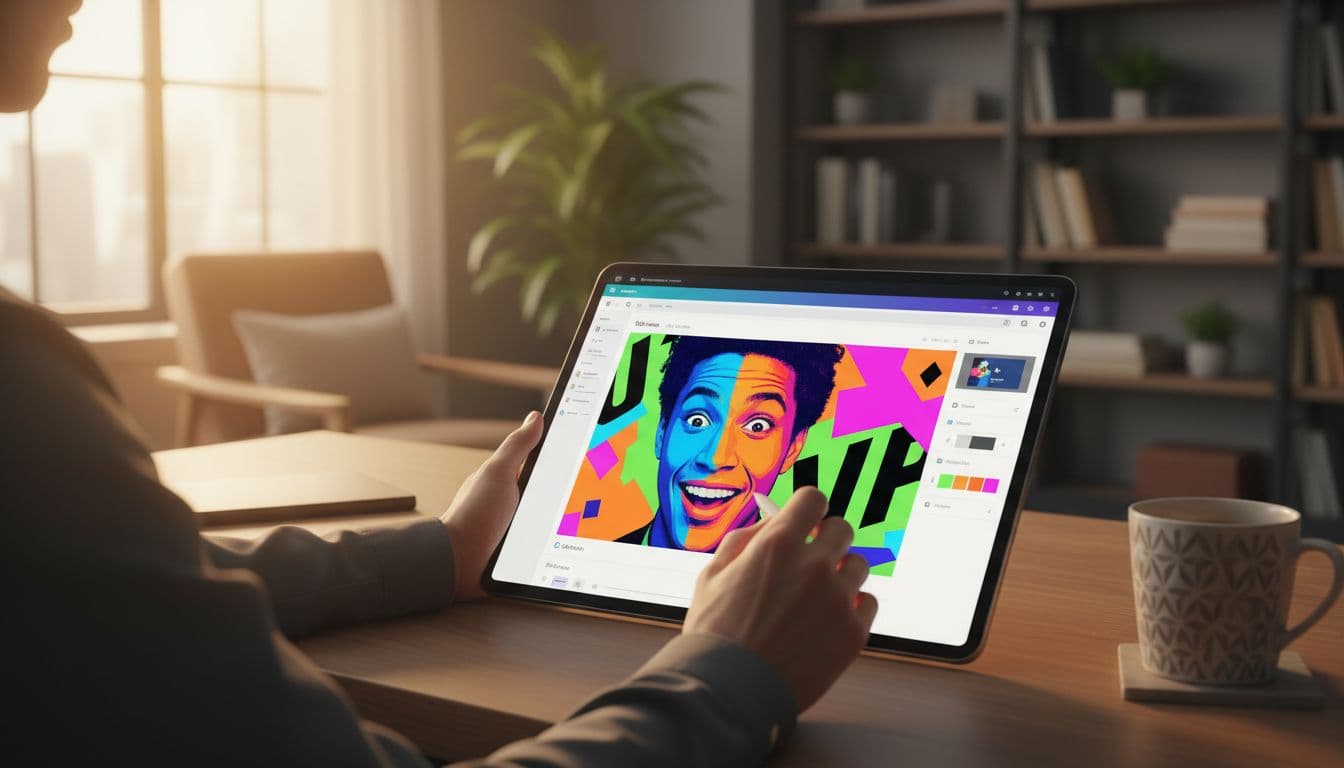
How Fliki AI Helps You Create Video Thumbnails Faster
When speed matters, built-in options save you from starting with a blank canvas. That’s where Fliki helps.
It now gives you three auto-generated thumbnails for each video, so you can choose the one that fits best, rather than having to build everything from scratch.
That matters more than it sounds. Sometimes your first thumbnail idea isn’t the strongest one. Seeing three choices side by side lets you compare mood, framing, and visual punch in seconds.
You can move faster, especially when you’re turning blog content into video or repurposing clips across multiple platforms.
If you’re already using Fliki for video creation, this streamlines the publishing workflow. You can read more about that in this Fliki AI review.
Three thumbnail suggestions give you room to compare without slowing you down. Fliki pulls visual ideas from your video transcript to create these auto-generated thumbnails, so that one might feel more emotional.
Another might frame the subject better. A third might look cleaner on mobile. Plus, the Ask Studio feature offers AI-driven assistance for refinements.
That’s useful when you’re posting on YouTube and then reworking the same video for Meta Reels. You may want one option for a longer-form video and another that fits a short-form look, such as a 4:5 thumbnail for vertical videos. Instead of redesigning from scratch, you start with choices.
For creators and bloggers, that kind of shortcut adds up. Less time designing means more time publishing.

How to pick the best Fliki thumbnail for clicks
The best-looking option isn’t always the one people tap. Pretty doesn’t always win. Clear wins.
Use a quick check before you publish your custom video thumbnail:
- Pick the version with the clearest subject first.
- Make sure the image matches the video’s topic and tone.
- Skip options with tiny or crowded text.
- View it small, because that’s how most people will see it.
- Choose the one that sparks curiosity without feeling misleading.
If one design looks stylish but confusing, leave it. A thumbnail should make the viewer think, “I get this, and I want to see more.”
When to Use TubeBuddy or Canva to Make a Stronger Custom Thumbnail
Auto-generated thumbnails are helpful, but sometimes you want more control. Maybe your YouTube channel has a set style. Maybe your blog, YouTube videos, and social clips all need to feel like the same brand.
That’s when TubeBuddy and Canva fit in.
TubeBuddy is useful for improving results over time. Canva is useful when you want to shape the look yourself. One helps you refine performance. The other helps you build the design.
 ### How TubeBuddy helps you test and improve YouTube thumbnails
If YouTube is a serious channel for you, TubeBuddy can help you stop guessing. It integrates with the YouTube Studio app and YouTube Android app for on-the-go management, so you can compare which performs better and build more consistency across your channel.
That matters because thumbnail success is rarely one-and-done. You learn over time. Which colors get attention? Do face close-ups work better for your audience? Does clean text beat no text on your tutorial videos?
TubeBuddy helps you look at performance with more discipline. Just ensure your account is verified and active to upload custom thumbnail content, and keep the daily custom thumbnail limit in mind to plan.
For YouTube creators, that’s where progress happens. You stop designing for your own taste and start designing for viewer response.
Why Canva is useful when you want full design control
Canva is a good fit when you want hands-on control without opening complex design software. You can build templates, lock in your brand colors, place text exactly where you want it, and resize visuals quickly.
For example, you can design podcast thumbnails using a 1:1 aspect ratio that works across different platforms.
It’s also helpful when your thumbnail has to work in more than one place. Custom video thumbnails look great in the embedded player, and Canva helps maintain consistent aspect ratios.
Maybe you want one polished image style for your blog post, YouTube upload, and social promotion. Canva makes that easier because you can duplicate, tweak, and export fast.
If you like consistency, Canva gives you that. If you like freedom, it gives you that too.
Final Thoughts: Create Video Thumbnails Better and Faster
You don’t need one perfect tool for every thumbnail. You need the right path for the job.
Use Fliki AI when you want quick, built-in choices. Use TubeBuddy to improve YouTube performance over time. Use Canva when you want full control over layout and branding.
The best way to create video thumbnails that stand out is the same across platforms: make them clear, honest, and easy to read on a phone. Always check your custom video thumbnails against the Community Guidelines before uploading.
Reference Ask Studio one last time for 16:9 aspect ratio designs that pop in the watch feed. That’s what earns the tap.
Frequently Asked Questions
A good thumbnail is easy to understand in one second with a clear subject, strong contrast, large, readable text if needed, and a consistent style. It must work on mobile screens and honestly match the video content. Clutter kills clicks—keep it simple like a billboard at speed.
YouTube requires a 16:9 aspect ratio at 3840×2160 resolution, with JPG, GIF, or PNG files under 2 MB. All must follow Community Guidelines to avoid issues. Test on phone screens first, as that’s where most views happen.
Fliki automatically generates three thumbnails per video from your transcript, letting you compare options quickly. Pick the clearest one that fits your platform, like 16:9 for YouTube or vertical for Reels. It speeds up workflows when repurposing content across platforms.
Use TubeBuddy to test and track YouTube thumbnail performance over time and learn what works for your audience. Canva is best for full custom control, branding templates, and resizing for multiple platforms. Auto-options like Fliki are great starters, but these tools are refined for consistency.
No, only add short, bold text (2-4 words) if it sharpens context for tutorials or reviews. If the visual alone sparks curiosity, keep it clean to avoid clutter on mobile. Always ensure high contrast so it reads fast.
Disclosure: This Inspire To Thrive blog post contains affiliate links. I may earn a commission from qualifying purchases at no extra cost to you. Some sections were drafted with AI tools and carefully reviewed/edited by me.