Whether your business is based online, with no kind of real-world outlet, or a brick-and-mortar store or business is your primary source of income, with an online presence to support it and help it to grow, your website building is a crucial element to your business.
Even the smallest of businesses today have a website and a social media presence.
Table of Contents
Your Site – Make It As A Tool
Your website is a fantastic tool. It can help you to attract new customers and give you a way to reach a much wider audience. A website can give you an easy way to communicate with your customers and a fast way to provide them with any information that they need.
On the other hand, it also offers your customers an easy way to reach you, ask questions, and provide honest reviews and feedback. Your website has many benefits, to both your business and your customers, and it’s easy to see why so many brands are investing so much time and money in theirs.
But, it’s only a useful tool if it’s used well. You might think that your website is easy to navigate, loads quickly, makes sense, and gives your customers what they need, quickly and without confusion.
But, you spend a lot of time on it, and it’s really not you that it needs to impress. If you don’t have the time it’s best to hire a web design company to do it for you.
Make Your Website Building User Friendly
A good website needs to be user-friendly, easy to navigate, and exceptionally simple. The layout needs to make sense, essential information needs to be easy to find, and if you sell online, the process should be straightforward and fast.

Take a second to look at your website as someone who has never been on it before, is it really user-friendly, or have you just gotten used to it?
Is Your Website Accessible?
Firstly, ask yourself if your site is accessible to everyone as you are having a website built. Do you have up-to-date translations installed? Is your font easy to read?
Are your photographs and graphics have descriptive and helpful alt text?
Do your videos include audio description services? Is it keyboard accessible, or are there areas that require a mouse to view?
Consider getting a focus group to spend some time on your site and offer your feedback. They might spot things that you don’t.
Does Your Website Work Well On All Screens?
Not everyone viewing your website will be doing it on a desktop computer. In fact, most of them probably won’t be. You might find that the majority of your viewers are on tablets, smartphones, and other devices.
But, chances are you work on it on a desktop or laptop with a large screen. What you see, isn’t necessarily the same as everyone else.
Take the time to check your site on different screen sizes, to make sure that it looks the same, all of the pictures and graphics fit, and the headings still make sense.
I’m always checking my mobile device when I publish a new blog post and poke around a few pages while I’m there.
Is Your Website Building Made For Speed?
Modern websites are huge. Yours probably has videos, photos, and plugins taking up space. This can make things slow.
But, most users will click away if a site doesn’t load within a few seconds, as we’ve become so used to instant internet access.
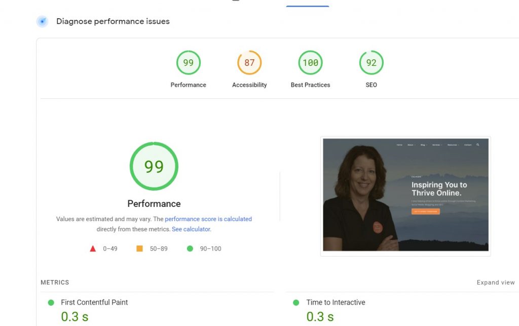
If your site is slow, consider optimizing images, hosting videos on YouTube and embedding them, and other website speeding-up techniques If you are unsure, go to the Google page speed test page.
Of course, you can (and should) check the mobile speed. Sometimes plugins come and go, so be sure to monitor those too for your website as they can slow down the speed of your website. (As you can see below I have a little work to do on accessibility.)

Does The Navigation Make Sense On Your User-Friendly Website?
For your website to be easy to navigate it needs to have basic things like an easy-to-find menu and a search bar. But, beyond this, ask yourself if it makes sense.
Do your website categories and menu items make sense? If you came on looking for specific information, could you find it easily?
How Is Your Readability?
Many website owners are guilty of focusing so much on SEO and keywords that their text is hard to read and sounds unnatural when reading out loud.
Make sure it’s easy to read with headings, small paragraphs, and good writing, and SEO should follow. Break up large chunks of text with bullet points, pictures, and graphics.
Then make sure you proofread everything at least twice, with one real-through out loud to get a better idea of how it sounds.
Can Your Website Make Money?
Have you ever tried to make a transaction on your website? With a sharp change in consumer behaviors and trends towards buying online, if you are using your website as an eCommerce platform to sell products or a service, it’s essential to make sure that you have an up-to-date payment system.
Flexibility and choice are important to many customers, so look into systems, such as this site, that work for any bank or payment source for a smooth customer experience.
Have you ever tried to make a transaction on your website? That’s the way your website can make money.
Have you tested your links, your email sign-up form, and your social media buttons as your website is building a new look?
The best way to make sure things work is to check them for yourself. Do this regularly, don’t just assume that because it worked when you installed it, it always will.
Make sure your website is also protected from being hacked.
Conclusion: Website Building To Increase Leads
In wrapping up, creating a user-friendly website is key to converting visitors into leads. Focus on clear navigation and fast loading times.
Make sure your content is easy to read and relevant, and use compelling calls to action that speak directly to your audience’s needs. Don’t clutter your pages. Keep the design clean and professional, ensuring it’s mobile-friendly too.
Regularly update your site with fresh content to keep users coming back. Remember, a simple contact form can make reaching out easy for potential leads.
By prioritizing user experience, your site can become a powerful tool for generating leads.
How often do you test for website usability yourself? Do you have someone to monitor your website for usability?
I’d love to know more in the comments below about how you are making your website more user-friendly.
- Pinterest Links: How to Fix Wrong URLs on Old and New Pins - January 9, 2026
- What To Do When Someone Steals Your Blogging Ideas - January 8, 2026
- Instagram Story Viewer: Watch IG Stories Anonymously and View Content Safely - January 7, 2026


Hi, Lisa,
Website design is more than layouts, colors, and all the bells and whistles; it’s about providing optimal user experiences and giving people what they want, and making it easily accessible.
Most importantly, how fast the page loads is critical to the overall user experience. If it takes longer than 2 – 3 seconds, you could be losing money to your competitors.
Thanks for sharing this, Lisa.
Hi Shamsudeen, yes, I agree, It is more about the design for sure. The function and SEO as well as making it easy for readers is very important over the design. A quick website is a must today for sure! Thanks for coming by Shamsudeen and have a great day.
All excellent tips Lisa. Making your site easy to read gives you a clear advantage over sites with a poor UX. I feel like too many bloggers spoil the user experience by being hellbent on gaining subscribers, getting ad clicks and making sales. Bloggers obsess over getting something from readers due to fear then screw up the UX, making the blog invasive, rude and even obnoxious. Give readers what they want and they will give you what you want. Have some faith, guys. Trust yourself, trust your content and trust the process.
Thank you Ryan. I agree, especially when you land on a site with all ads and you can’t even click on the content to read it! That drives me nuts. Agree, have faith and trust in your own work and it will work in due time. Thanks Ryan. Have a great week!
Hi Lisa,
Yet another wonderful and informative post for bloggers. Yes, I fully agree with you that, as the technology is fast growing and the desktop use is limited and a good number of people are using the handy devices like tablets, smartphones, etc. So, it is a must to check that our sites are mobile friendly or not. Also, the speed is a wonderful criterion to look into.
Though some of them I am following, sad to say that a good number of them I am yet to check into.
Thanks, Lisa for this useful post as usual.
I read about this post on the pages of BizSugar and I up-voted it and commented.
Keep sharing.
Have a great time of sharing ahead.
Best
~ Phil
Hi Philip, thank you. I am in the process now of updating some plugins to increase my mobile speed here. Some plugins just don’t keep up with the latest technology out there. Always good to have a techie help a blogger along the way. Thanks for sharing everyone Philip, I do appreciate that!
Have a wonderful day there.
Great read! I’ve learned a lot from this article, will definitely apply this to my website. Thank you for sharing, very helpful and informative!
Hi Ariel, welcome to Inspire To Thrive. Thank you, what point did you learn the most from this one? Do have a wonderful day.
Having a user friendly website is a plus for our website, I have a client whose website is not user friendly and responsive. I am troubled to use it when opening the website on my handphone. Your article is very good
Hi Paket, welcome to Inspire to Thrive. Were you able to help that client with their website? A mobile friendly site is so important today as it’s the most way websites are being viewed. Thanks for coming by and have a great day!
Hi Lisa,
Great article. Not a lot of people know that a slow website can create frustration which converts to giving up easier than committing to your actions and open that damn website.
I wanted to add a little thing about readability because that is a very important subject. If your audience does not know what you’re talking about chances are they will just scan through your article and leave without remembering what was written.
There are a bunch of tools when you search on google for Article Readability. They have helped me a lot with writing better content. I know that WebFX has a great readability test tool.
Thanks,
– Engin
Hi Engin, welcome to Inspire to Thrive. Yes, a slow website sure can cause a lot of frustration! I know I leave if I can’t find what I’m looking for fast and easy. Great point on readability too. Keep it simple as I say when writing.
I remember that tool from WebFX, excellent tool and point. Thanks for the input on this one Engin. I hope you do register with gravatar, your comment almmost went into the spam folder.
Have a great day!
Hi Lisa,
What a great reminder to check my speed again. I haven’t done that in a while. Thank you! I do check my opt-in forms for email and courses, and they work. I learned that one the hard way when someone told me they were going to a 404 page….Yikes!
I like a website that has a white background and plain fonts. It has to be easy to read and of course to navigate. Keeping things simple as possible can work.
Thanks for the reminders,
-Donna
Hi Donna, oh yes, I check mine at least monthly. Things change with plugins, they get old.
Easy to read is key today – thanks for coming by Donna. What happened to your gravatar, your photo doesn’t show here anymore? Did you change email? I think you have. You can add that new email to your gravatar account to be seen again. Thanks for coming by!
? Fantastic points made, Lisa.
I would also like to add, that those website administrators and bloggers need to know how their website loads on various web browsers.
Hi Renard, great point, yes I sometimes check it out on I/E and there are websites you can check to see if it works on Apple, etc. Have a great day Renard.
Hey Lisa,
Are you using browserling regularly? Looks like a good one but the price looks like on a higher side. Is it’s free version helps?
Thanks for the share.
Have a great weekend.
~ Phil
Hi Philip, I am not but just started with FREE version. I noticed you cannot change the screen resolution with the free one. For what it does the price could be a little less. You are most welcome and I hope you have a great weekend as well Philip.