The traffic is there, the page is live, and the silence is deafening. You’ve built what you thought was a killer landing page, but the conversions just aren’t happening. It’s a common story, and one of the most maddening experiences in the digital world. People show up, look around, and vanish. Why are your high converting landing pages not drawing traffic?
I’ve been there and learned over the years at Inspire To Thrive how to make them perform better. Here are 10 ideas for you to create better converting landing pages.
Estimated reading time: 7 minutes
Table of Contents
Key Takeaways
- To improve high converting landing pages, focus on one specific action.
- Use visual hierarchy to guide users’ attention.
- Include a compelling headline and sub-headline combo to quickly convey the value of your offering.
- Make forms simple and minimize fields to reduce friction.
- Offer lead magnets for visitors not ready to buy.
What’s Missing?
What’s missing isn’t a magic button or a secret color scheme. The gap between a visitor and a customer is almost always a series of small, psychological disconnects.
High converting landing pages don’t just look good; they are built with a deep respect for how people actually think.
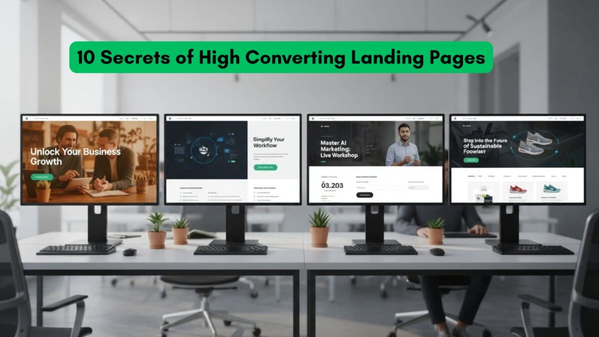
1. Give Your Page One Job. And Only One.
A landing page that tries to do everything accomplishes nothing. Its sole purpose is to get one specific action. That’s it. The fastest way to kill your conversion rate is by giving people too many choices.
That navigation bar linking to your blog and company history? It’s not a helpful guide; it’s a set of emergency exits leading people away from the one thing you want them to do.
The best landing pages are militant in their focus, often removing the main navigation entirely. This creates a closed loop where the user has two clear options: engage with what you’re offering or leave.
2. Be a Tour Guide for Their Eyes
People don’t read web pages; they scan them. Their eyes bounce around looking for something interesting. Your design shouldn’t fight this; it should use it. Visual hierarchy is how you grab a visitor’s gaze and tell it exactly where to go.
Your headline should be the bouncer at the door. Big, unmissable, and setting the tone. Your call-to-action (CTA) button needs to be a splash of contrasting color that draws the eye.
And whitespace? That’s not empty space. It’s a spotlight, forcing attention onto the elements that matter.
You’re creating a visual path that leads a person from “What’s this?” to “I need this.”
3. The Headline/Sub-headline Combo of High Converting Landing Pages
You get a few seconds, tops. That’s the window you have to convince someone they’ve come to the right place. The headline throws the first punch, but it needs the sub headline to make it stick.
The headline makes a bold claim or asks a question that stops the scroll. It’s the hook. The sub headline immediately swoops in with the context that makes the headline believable.
4. Sell the Future with Your Hero Shot
That big image or video at the top of your page is your hero shot, and it’s not just there to look pretty. A stock photo of smiling people is visual junk food, as it fills space but offers no nutrition.
A great hero shot doesn’t show your product; it shows the result of your product.
5. Write for People Who Hate to Read
People will not read your page word-for-word. They’re busy, distracted, and looking for an excuse to leave. You have to write for the scanner, the skimmer, the person with one foot out the door.
This means short sentences and paragraphs that are only two or three lines long. Use bolding to make your key promises jump off the page.
Bullet points are a gift, turning a dense paragraph into an easy-to-digest list.
6. Use Social Proof Like a Scalpel
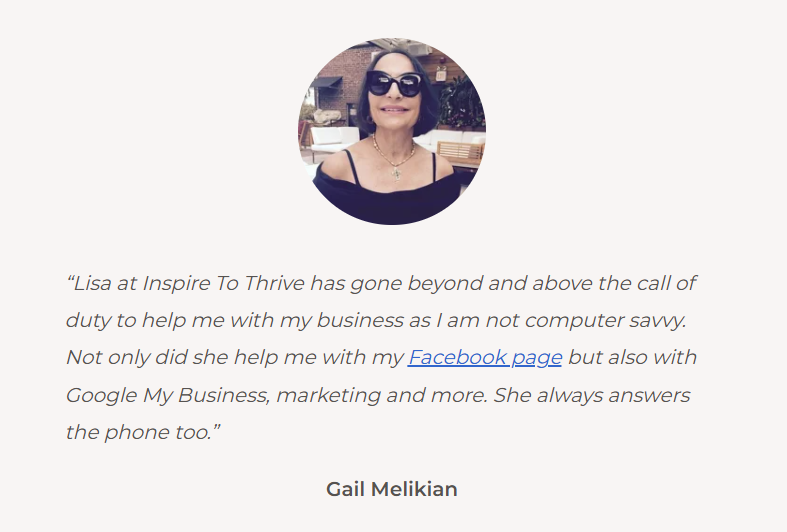
“Other people bought this and didn’t regret it.” That’s the powerful, unspoken message of social proof. But just dropping testimonials at the bottom of the page is a waste. You must place them with intention.
Is a visitor looking at your pricing? That is the exact moment to show them a quote from a customer raving about the value they received. Are they reading about a feature that might seem complicated?
Put a testimonial right there from someone who says, “This was surprisingly easy to set up.” Logos, user counts, and media mentions are all little nudges that say, “You’re safe here. Others have gone before you.”
7. Make Your Forms Feel Invisible
Every box in your contact form is a tiny tax on your visitor’s motivation. Each field you add increases the total bill, and at some point, they’ll decide it’s too expensive and walk away.
- Be a ruthless minimalist.
- For a newsletter, you need one thing: an email address.
- Don’t ask for a name.
- If you absolutely must collect more data, use a multi-step form.
- The first step asks for the easy thing, like an email.
That’s a small “yes.” Once they’ve made that micro-commitment, they are far more likely to finish the process.
8. Your CTA Button Is Not a “Submit” Button
The words on your CTA button are arguably the most important on the page. Yet, so many pages use lazy, boring verbs like “Submit” or “Download.” These words are about what the user has to do for you.
Flip the script. The button’s text should be about what the user is about to get.
It should complete the sentence that’s already in their head: “I want to…” So, “Sign Up” becomes “Create My Free Account.” “Download” becomes “Get My Free Template.”
It reframes the click as the satisfying conclusion to their journey, not a chore.
9. Have an Offer for the “Not Yet” Crowd
Most of your visitors are not ready to buy today. They are window shopping. If your only CTA is “Buy Now,” you are speaking to a tiny fraction of your audience.
You need a valuable offering for the people who are interested but not yet sold.
This is the perfect job for a lead magnet. Instead of asking for the sale, ask for their email in exchange for something genuinely useful.
A guide, a checklist, or a tool that gives them a personalized answer can be perfect. For instance, you could create a lead magnet like a calculator that helps them solve a problem.
This turns a one-time visit into a long-term conversation, allowing you to build trust until they’re ready to buy.
10. Speak the Language of Legitimacy
Before anyone gives you their email, let alone their credit card, they have to believe you’re legitimate. Trust isn’t built with a single badge; it’s communicated through a thousand subtle signals.
A clean, modern design is the entry fee. But it’s also the absence of typos, the easy-to-find link to your privacy policy, and the security seals near payment fields.
Together, these elements create an atmosphere of professionalism.
Secrets of Top Converting Landing Pages: Creating Empathy
In the end, these “secrets” all point to one guiding principle: empathy.
When you stop thinking about what you want to sell and start obsessing over how you can create a clear, confident, and helpful journey for the person on the other side of the screen, you stop chasing conversions.
You start earning them.
- How To Pin A Post On X Today: Boost Your Visibility Up - April 3, 2026
- When Do You Need a Private Instagram Account? 7 Signs To Know - April 3, 2026
- Instagram DM Encryption Change in May 2026: What You Should Do - April 2, 2026
